
Autumn officially started yesterday and a few of the trees around here have started their change of color. I love fall. I do think it's my favorite time of year. The leaf peak is usually around Columbus Day, but I hope it holds on a bit this year as my Mom is coming from Texas for a visit later in the month and it would be great if there's a bit of New England color left for her to see.
But I've been thinking more about color as it relates to our beading, especially those of us who make things for sale. Most of you probably already know about the Pantone color predictions, but if you don't, let me share some good news. Pantone predicts the fashion colors for every season and manufacturers ranging from everything from home dec to clothing to car companies use their predictions as guidelines for the colors of their products. You can easily access the fall and winter 2010-11 colors from the Gemorama website with a link provided in this blog, as well as from the Fire Mountain Gems website. This fall's colors are delicious. Do you have colors that you really like and rarely venture away from? Well kid, you need to break some of those habits and look beyond your comfort zone...OR find new colors that work well with your faves.
Check out the Gemorama site. The first thing I see is a saturation of color in the fall/winter tones. Deep colors are definitely the way to go. Scroll down a bit and you'll see Pantone's top 10 fashion colors. Let's examine these closely. Good color combinations for beading mean you should have a variety of light, medium, and dark colors. The top 10 gives you that option. But beyond that, remember to look for combinations in your beads of finish: shiny, matte, sparkle, etc. Additionally, working on changing the size and shape of your beads as well as the colors will enhance your work; a simply strung necklace can move from nice to "WOW" if you can work in extra texture along with your colors.
The other thing I notice about the top 10 fashion colors is they work well with each other...another useful key in beadwork. Once you find a group of colors that works together, you have a huge combination of colors you can incorporate into your work because tints or shades of those colors will also within that group. Let me explain by giving you an example from my quilting instruction. Let's say you have a small piece of fabric that is a certain color and it goes with some others you have that you want to make a quilt out of. Unfortunately, that small piece is all you have of the color. You go to the store and can't find a match for that color anywhere. BUT, if you can find a tint (the color with white added to it to make it lighter) or a shade (the color with black added to it to make it darker) that selection will also work with the fabrics you have chosen. You don't have to match colors EXACTLY...you can find a tint or shade of the color that you only have a small piece of and it will still work with the other fabrics you have chosen.
Remember to try this with beading. If you have a small amount of a certain color of bead in your stash and want to incorporate it but you know the amount is not going to be enough, and you can't find the exact same thing again, a tint or shade of the color will be fine. And the cool thing about beading is you can also consider the finish and the shape as adding extra interest.
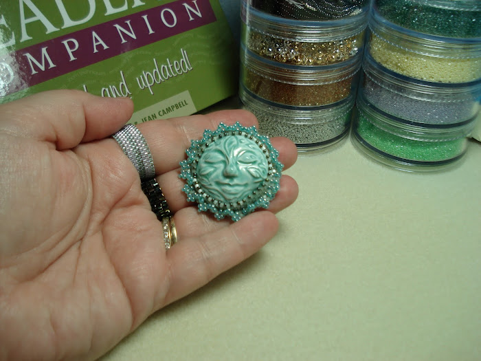
I'm taking a beading class this weekend with Stephanie Eddy. The beads are already kitted up, but I certainly plan to compare what I receive with items in my own stash to see if I can kick my project up a big by mixing in additional shades or tints of the colors in the kits. I can't wait to play!
TBH-Linda
Friday, September 24, 2010
Subscribe to:
Post Comments (Atom)


No comments:
Post a Comment